Photography, the art of glorifying and making memories last forever. But mastering this art requires that the person behind the lens have tons of talent and practice. One renowned photography master is Steve McCurry, whose famous photograph “Afghan Girl” appeared on the cover of National Geographic in 1984. McCurry has worked in photojournalism and editorial and has received awards such as Magazine Photographer of the Year and the Royal Photographic Society’s Centenary Medal.
So, if you want to receive some pieces of advice regarding photography, he’s the person to give them. Here’s a list of composition tips that will upgrade your photographies and make them stunning.
The tips go from the rule of thirds and leading lines to patterns and repetition and natural framing devices. Even when they are difficult to master they are really effective, also as McCurry said “Remember, the composition is important, but also rules are meant to be broken. So the main point is to enjoy yourself while you’re photographing and photograph in your own way and your own style.”
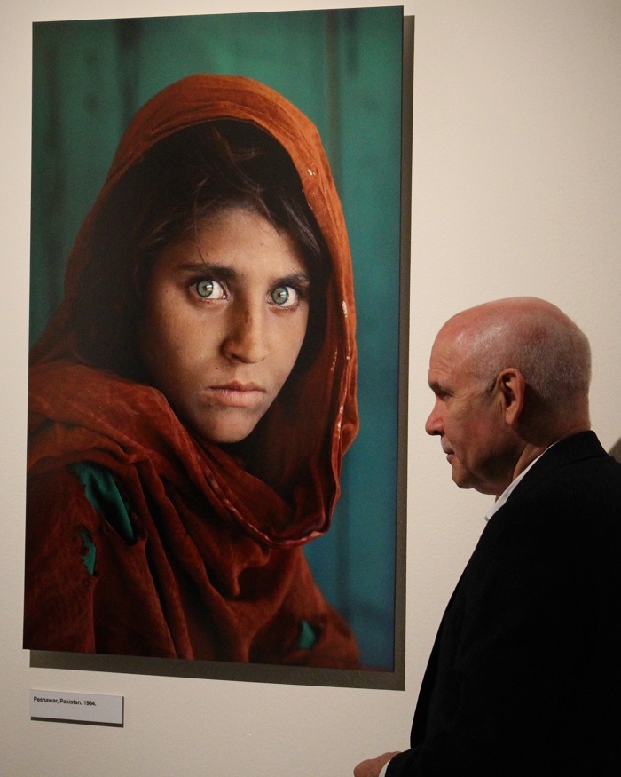
Here are the 9 core composition tips by Steve McCurry.
9. Symmetry.
Symmetry is pleasing to the eye, so look for balance in your composition and take advantage of it.
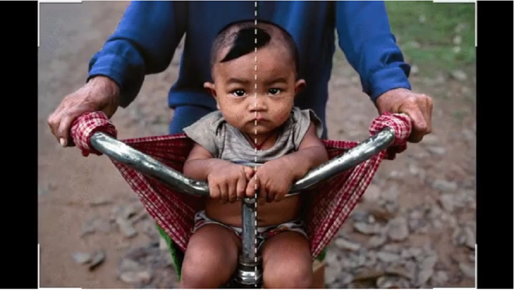
It can work both ways, either vertically or horizontally.
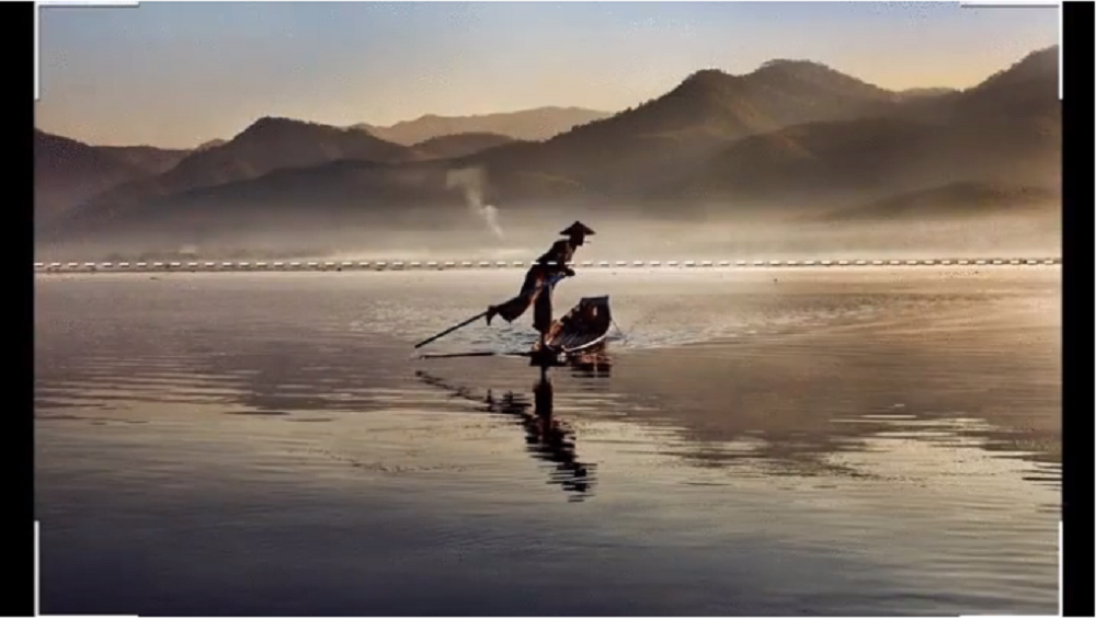
8. Patterns and repetition.
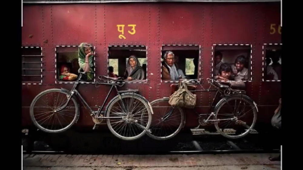
Patterns are aesthetically pleasing. But the best is when the pattern is uninterrupted.

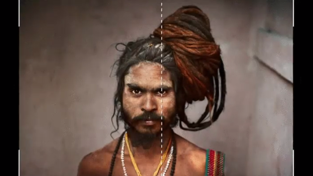
7. Center Dominant Eye.
Place the dominant eye in the center of the photo.
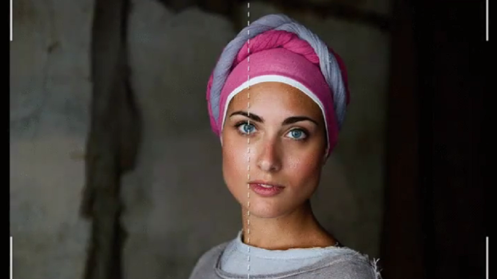
This gives the impression the eye follows you.
6. Fill the frame
Get close to your subjects, it will give them protagonism.
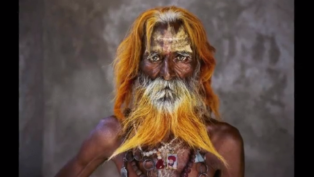
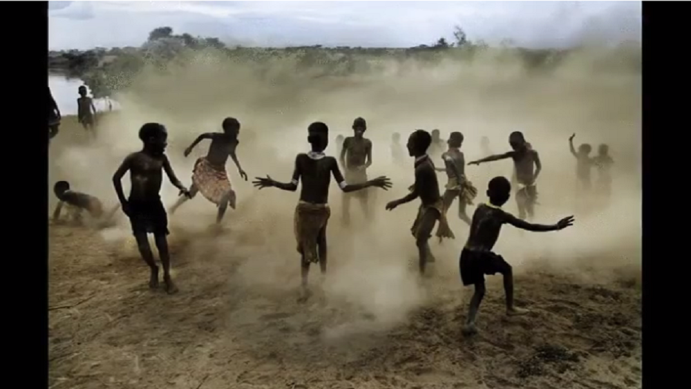
5. Figure to ground.
Find a contrast between subject and background, and make it noticeable.
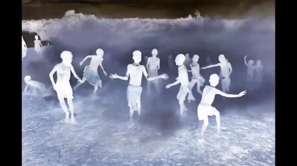
Like these kids playing and the dust at the bottom.
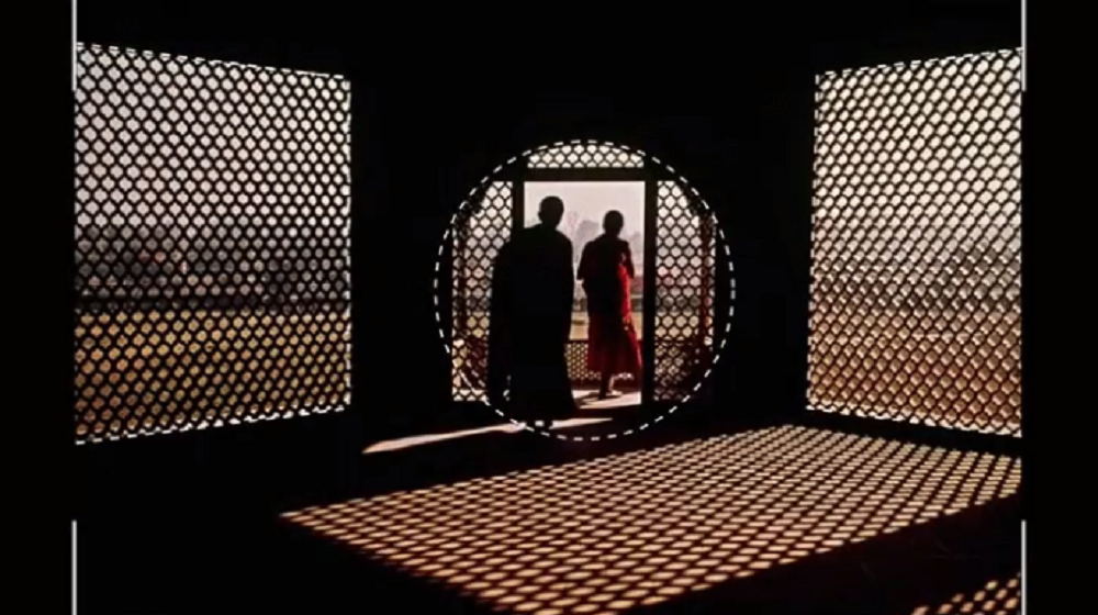
4. Framing.
You should study your setting, and then take advantage of it. Use natural frames like windows and doors.
This circular framed door is a perfect example.
3. Diagonals.
These type of lines help to create great movement.

Whenever you find them, profit.

2. Lines leading the eye.
Use natural lines to lead the eye into the picture.
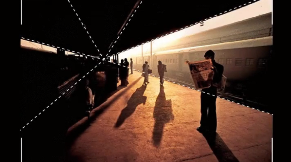
This way you can address the attention in a natural way to a certain point.

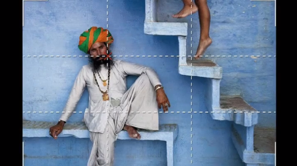
1. Rule of thirds.
Place the points of interest on interceptions.

This way you’ll give highlight some features of the composition.



Loading…